The making of a SaaS Plateform
Cap Collectif is a civic tech platform for participatory democracy. Its first design system was built in-house through close team collaboration and iterative prototyping to ensure usability and consistency.
Problem
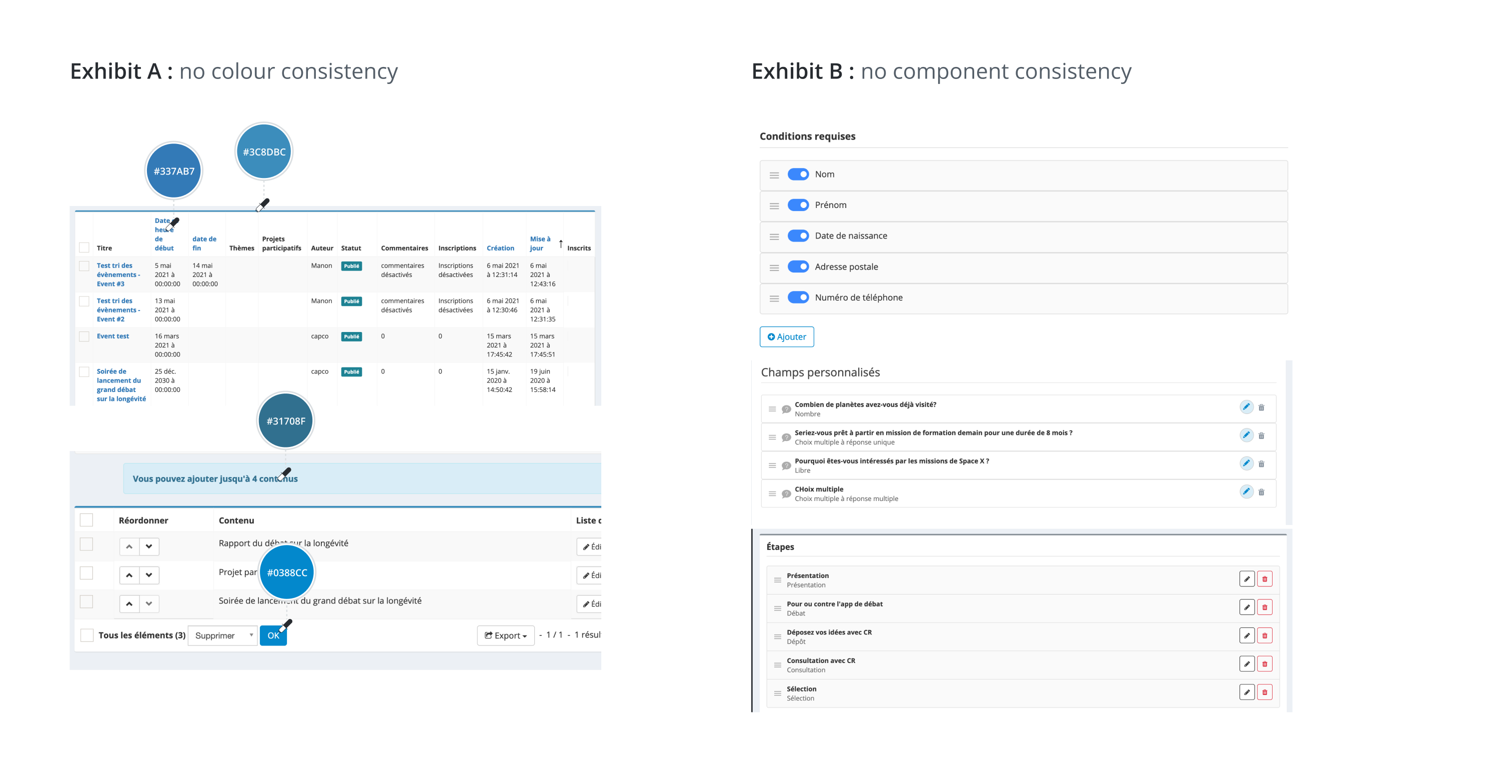
Lack of consistency leads to (user) confusion
Building a Design System was the first step to turn our plateform into a proper SaaS product. Since its birth, the product had never been redesigned, meaning the features had been added on top on one another snowballing into a complex system where the user had to memorize how to use the product. The previous Product team also didn't use a common library component or styleguide. As a result, the UI was incoherent to the point it created even more confusion in the user journey which overall impaired the user experience.
The endgame of our project wasn't merely updating UI components and templates, but turning the plateform into an user-friendly SaaS product by cleaning up outdated elements and processes and organise the system into an intuitive architecture. The product had been made using Sonata and Symfony, technologies which weren't very flexible in regard to design recommendation. This is one the reason why the previous Design team had been struggling with updating the product, "touchs up" were time-consuming and complicated to put in place.
As of 2020, our front-end development team started using React and Storybook. We put a lot of emphasis on team communication in order to work in a way which would be convenient for the party involved (designers, developers, QA, customer services...). I'll explain at the end of this use case our working process.
research
In-depth investigation of the product design
We started off by auditing the plateform UI and compared the colors, fonts and components from differents pages. As expected, it wasn't homogenous: for example, the blue HEXA (main color) was different on each page and buttons didn't have the same padding. We listed down our findings and created a "to-do list" of elements we'd need to kick-off our system.
This project was a good opportunity to transfer our workspace from Sketch to Figma. We studied Design System available to download on Figma (Ant, Polaris, Material...) in order to identify best practices, and we made up our own framework tailored to our product and team.
styleguide
Establishing Design rules
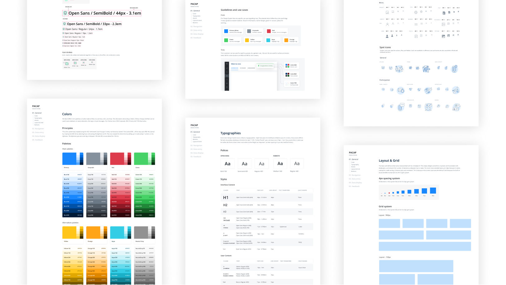
From these findings, we established a brand-new color palettes, an 8px grid, a typography system based on the Perfect Fourth ratio with an icon-friendly line-height and design rules for icons.
components library
Kicking-off our components ecosystem
We started with simple atoms necessary in most systems and extended our work to components we needed for our main projects. To showcase the design process, I'll explain how I made the Calendar organism (one of the most complicated nested organism in the Design System) through a quick case study (coming soon).
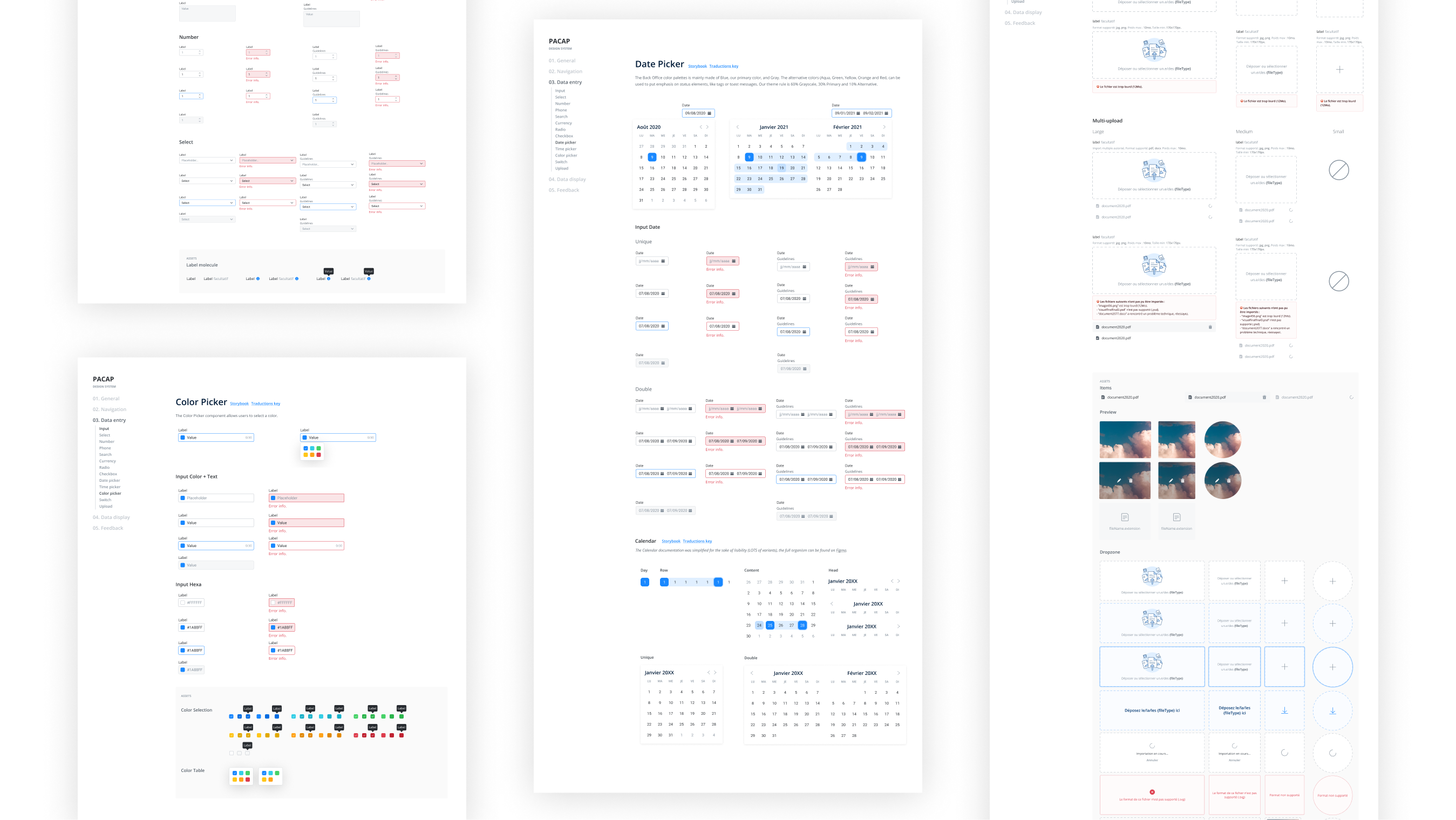
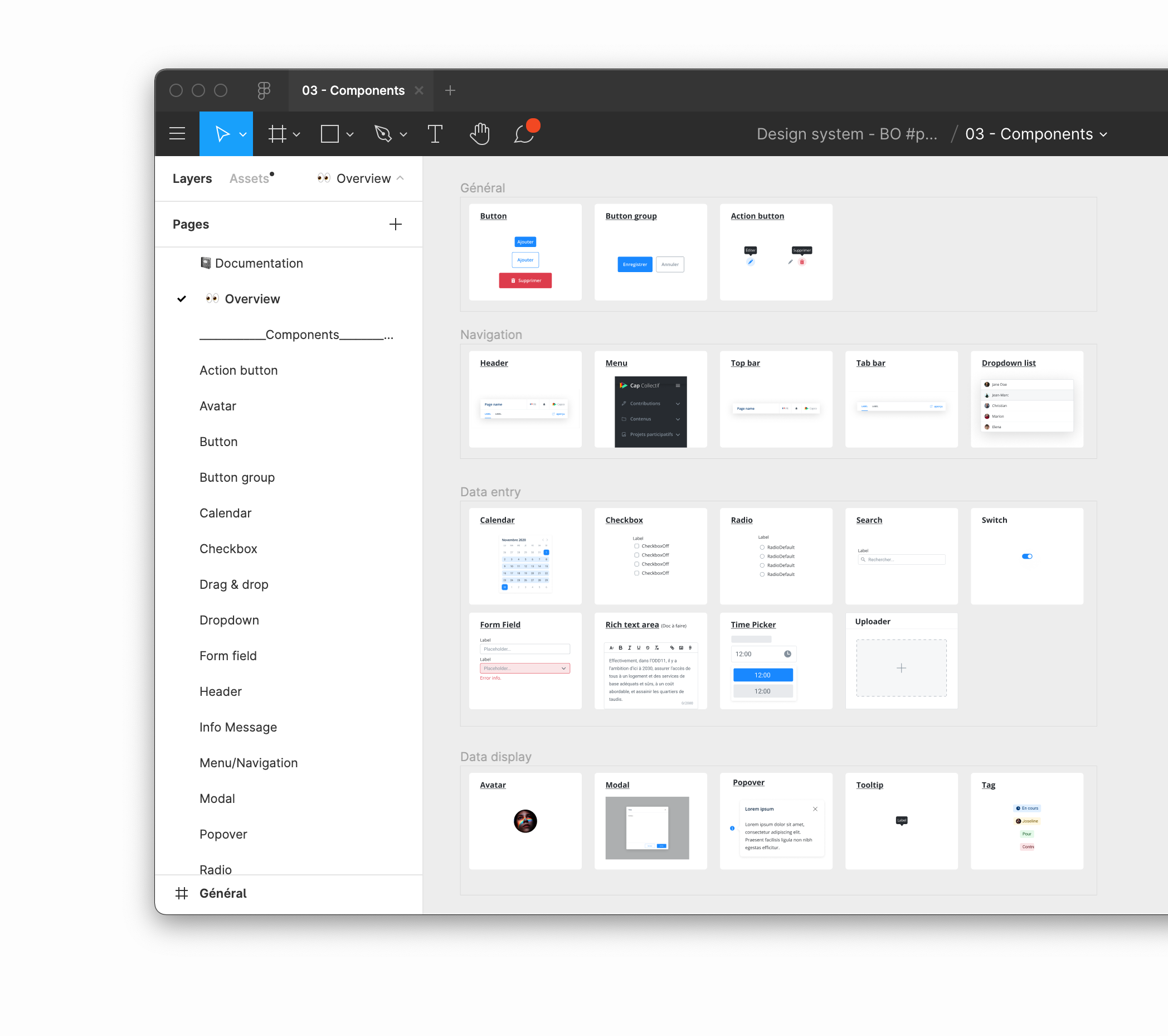
By the end of V1.0, our design system contained 100+ components (taking subtypes into account).
File organisation
Tidying up our work
Figma Component Variant System is a great tool to make sure our team follows the Atomic Design framework. If we want our components to work smoothly, we'll need to divide it in very small elements and establish ahead of time all the use cases for each. One of the issues we encountered was the overall organization of our Design System file. It does get tricky in complex components to evaluate which "legos" counts as a molecule or an organism, and our file started to get messy as we had molecules in our "Atoms" page and nested organisms in our "Organism" page.
Final step: implementation
The Design Team worked hand-in-hand with our developement team to implement the system smartly and smoothy. After some test and retry, we decided to stop working solely on Figma and transfered the specs on GitHub. We (design team) broke down the projects into smaller issues and created a broad, milestones and labels to organize the development of the System. Each issues were basically a copy/pasta of the Figma file, the goal was to make it so the developer would be able to get a grasp of the work without needing to open Figma at that point. Prototypes were also added if necessary.